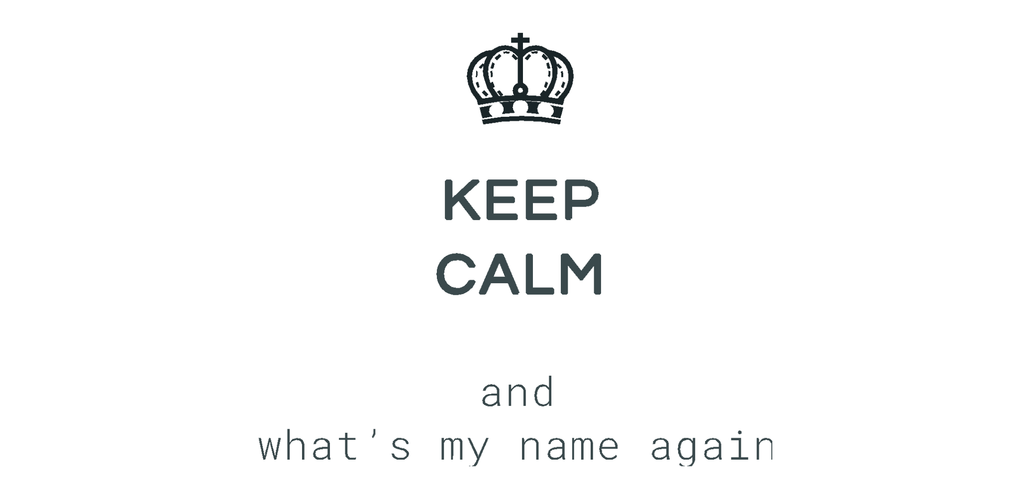
How hasn’t been in the situation, when you forget the name of the person, who has just been introduced to you. I guess, all of us. Would it be so much easier, if we didn’t have to use names. For instance, waiters never address their client by name, instead they make up short description, like rock star, turtleneck
Probably no name - no problems… hm, let’s see...
Let’s start with the definition. White labeling is when a product or service doesn’t have their brand and logo of the end product and instead uses the branding requested by the purchaser.
It is like a skeleton. You develop the product once and all the clients can use it as their own branded product with their personal data.
Poorly designed white-label products can damage a company's brand and the end user experience.
How to create beautiful and simple to use mobile app that easy to brand. It should be save and tailored solutions, that customers don’t need to have special design background. That it will be generic enough to suit most brands but customizable enough that a company could see their uniqueness in it.
The biggest challenge is that you need to keep every possibility in mind.
It is more comfortable to design when you have something to rely on.
But here you have everything in one.
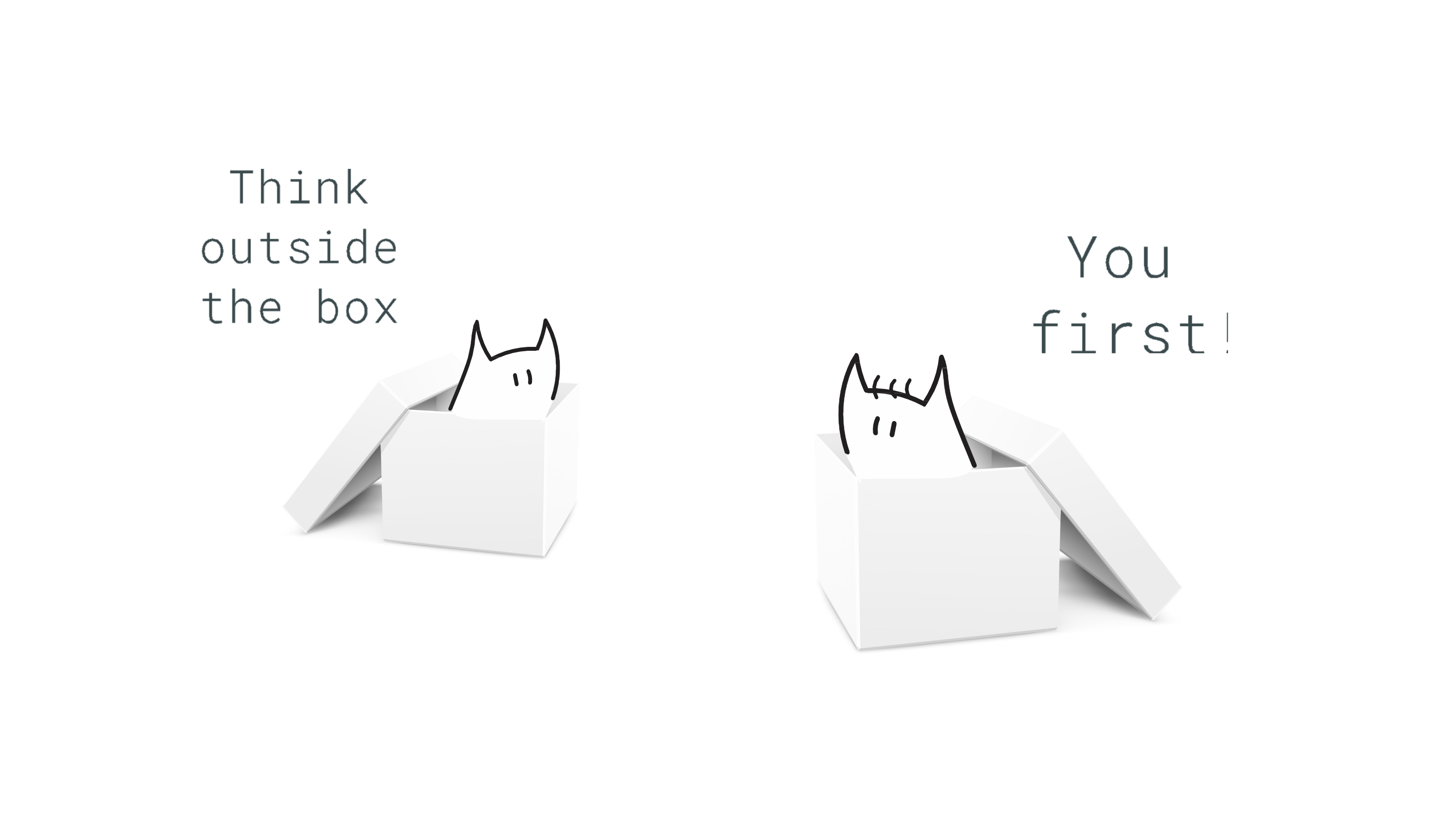
It is like something drags you out of your comfort zone. But that’s ok, we can extend our comfort zone instead.
When you have nothing to base on, what you can do to insure great user experience is following the best practices.
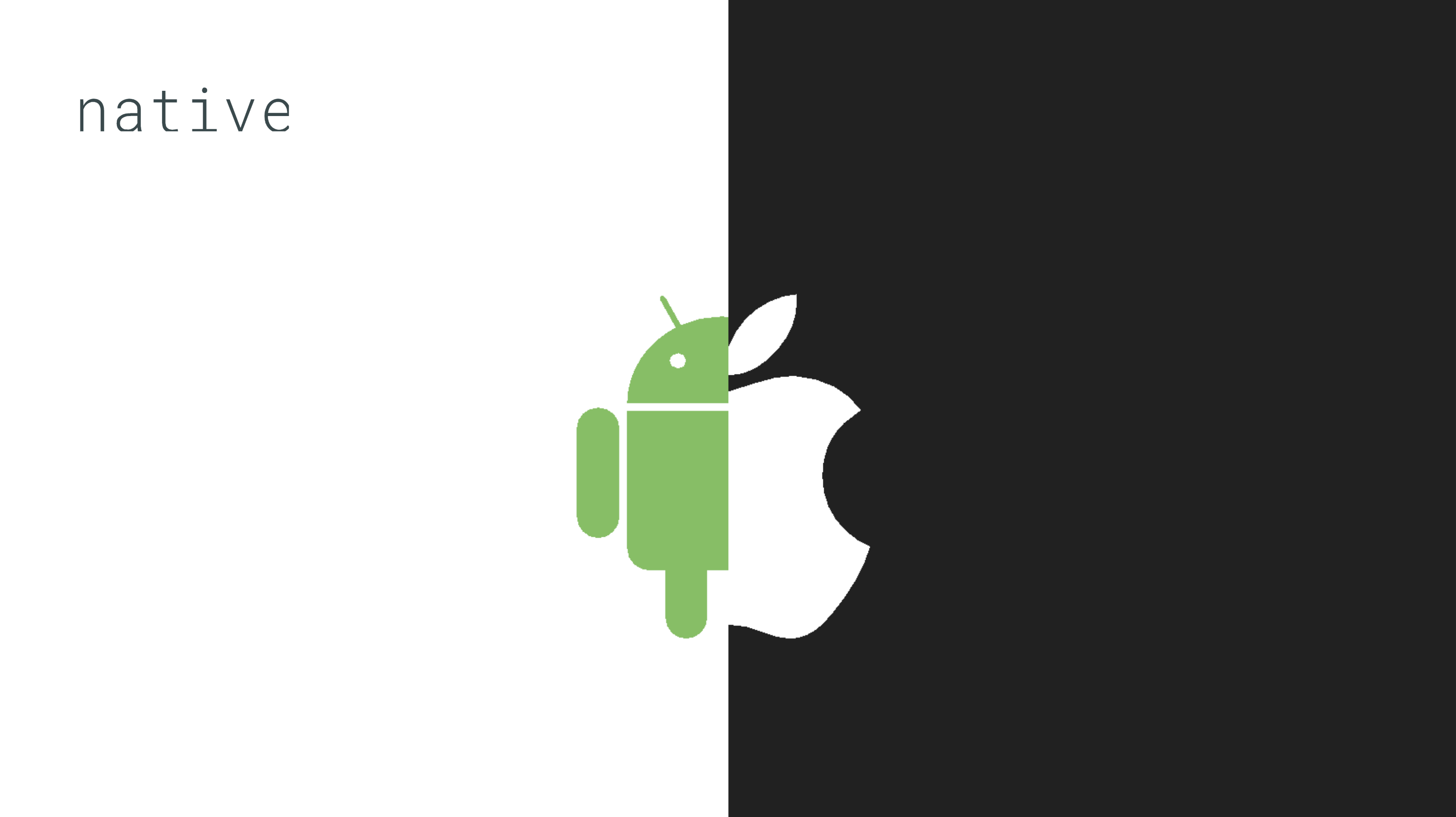
One of them is a native development when you create the app separately for iOS and Android. Follow native guidelines.
A lot of attention was paid to branding at the research stage. Where is the similarity and what is the difference? That will provide a good foundation for the ideation stage to come up with the solution for the branding feature. We actually came up with three solutions and all of them failed.
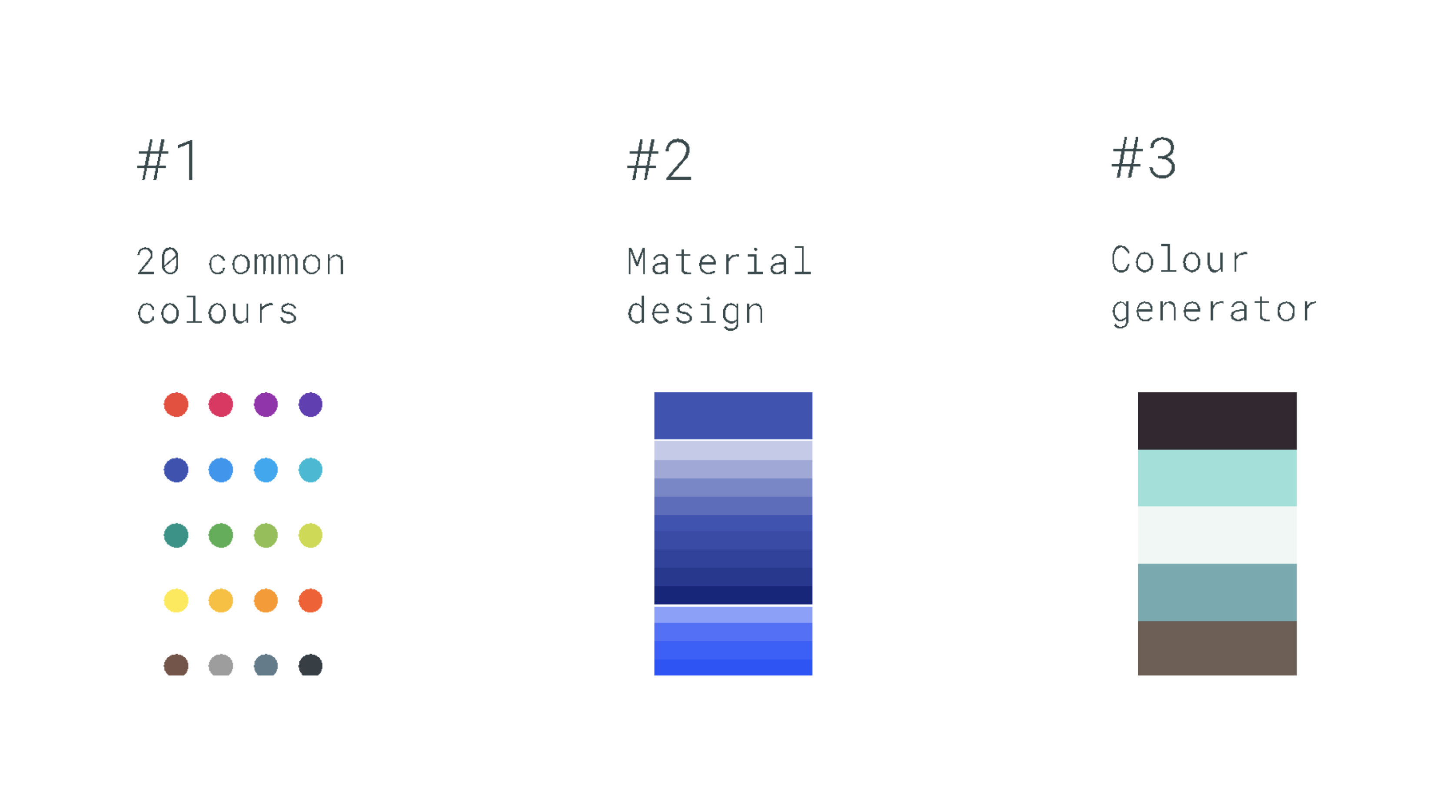
1 Solution
Limit the the colour scheme to 20 different palets ….
But branding research showed that there are so many colour combinations that it would be impossible to cover all of them.
2. Material design approach
Use one or two main colors and apply their light and dark shades
Good as a concept for Android, but not for iOS. From my experience iOS users would not appreciate the Android presence
3. Colour generator
To integrate with existing colour generator when based on a client colour it will produce the rest of the palet.
… Big dependency of the third party. And still was too flexible.
And now it is time for panicking. We are about to start development but still no concept yet. Hm, all of them still have a good points. Why don’t we combine the best parts of them?
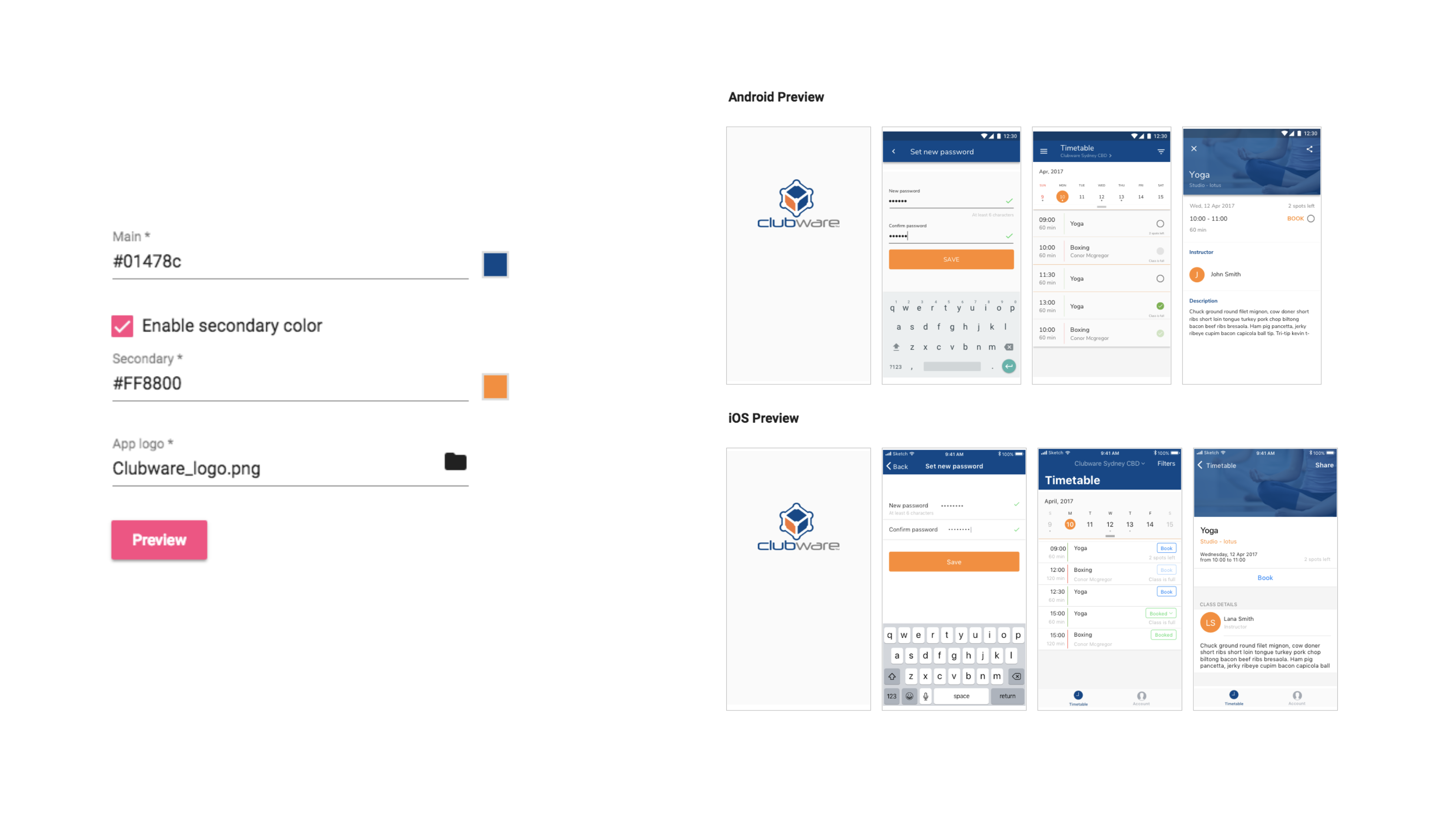
Most of people consume information better when it is visual. This is why the onboarding website has been done to help client to preview the mobile app with their branding before creating a build.
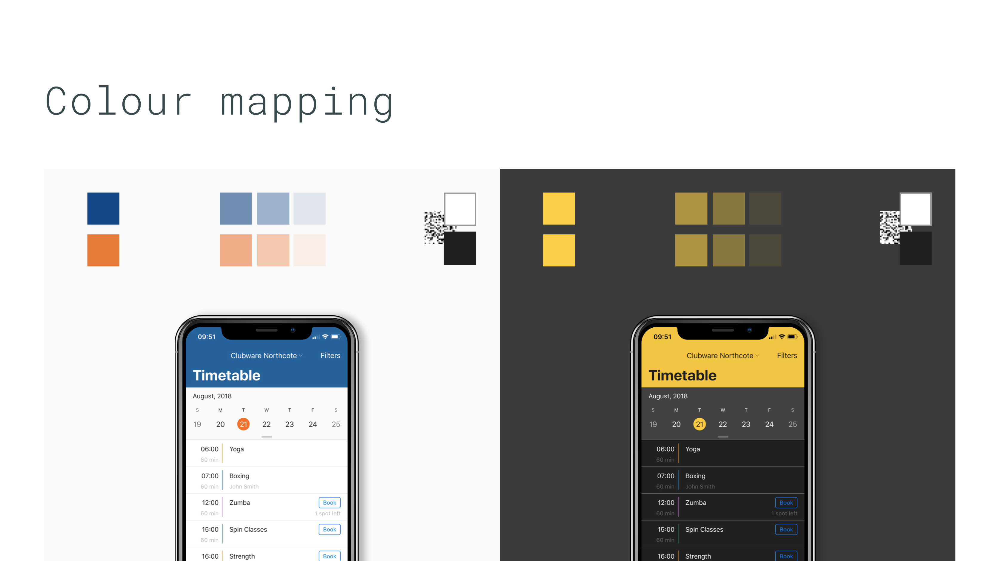
And here they are. Let’s use colour mapping instead of let custom assign colours themselves.
First of all, we should be flexible. The studies show that general branding palette contained no more then two colours.
So that one or two colours are the main branding representation and uniqueness. Give client a freedom to choose any colour that they associate with the brand.
Second, we shouldn’t be too flexible.
We use transparency of those main colours for different states and complementary elements.
Also we are calculating the luminance of the main and secondary colors to generate the text colour that it will be easily readable.
My research demonstrated that some gyms like boxing had very aggressive style. To cover this case we are going to offer the dark theme as well.
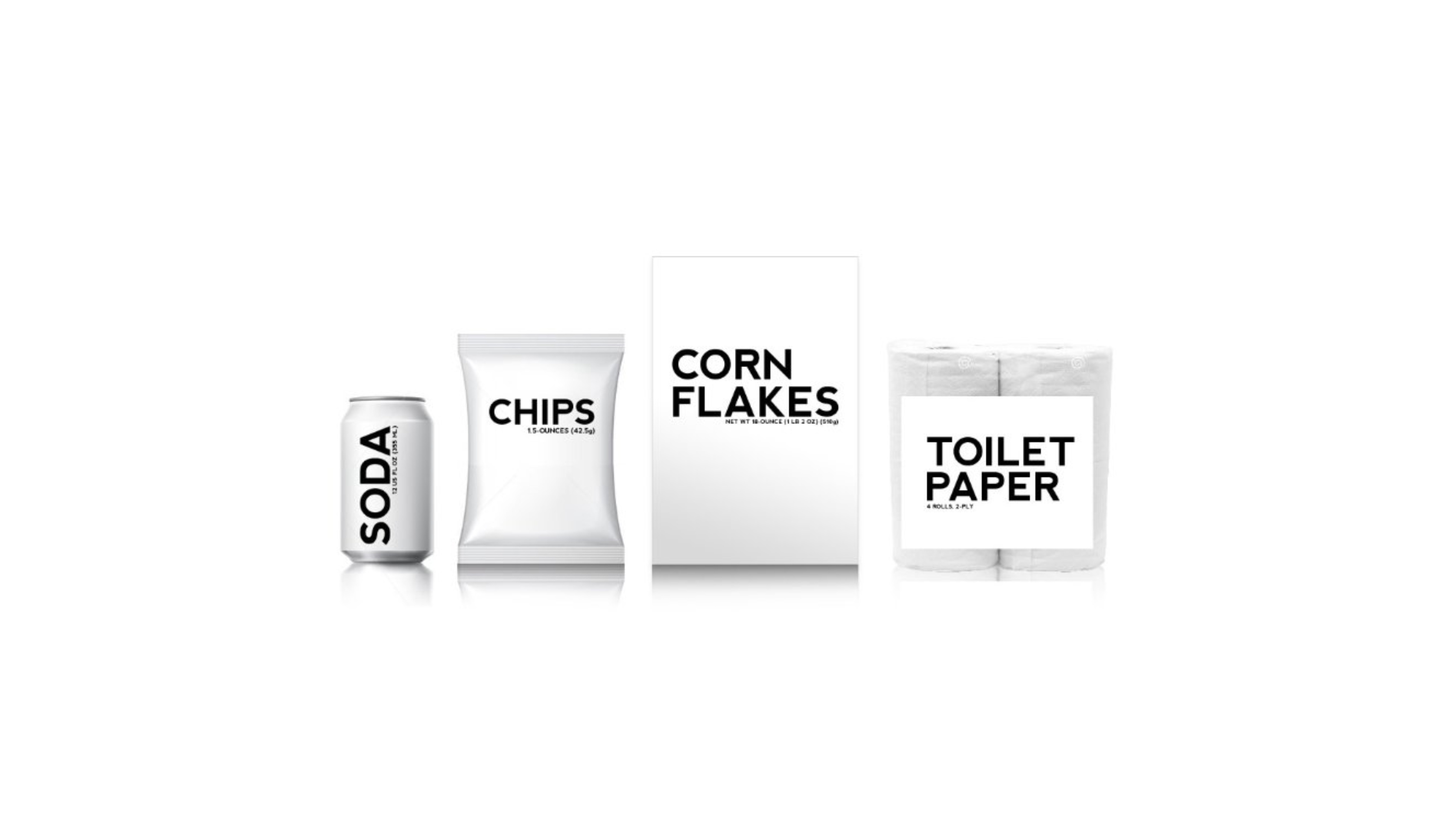
Another big challenge is data. As more things you allow user, then with more things you have to deal with in the feature. Don’t rely too much on human common sense because it never works.
Data is so different. For example, different images size or sometimes a lot of data or no data at all. You need to work around every possible scenario to ensure that the app handles it gracefully.
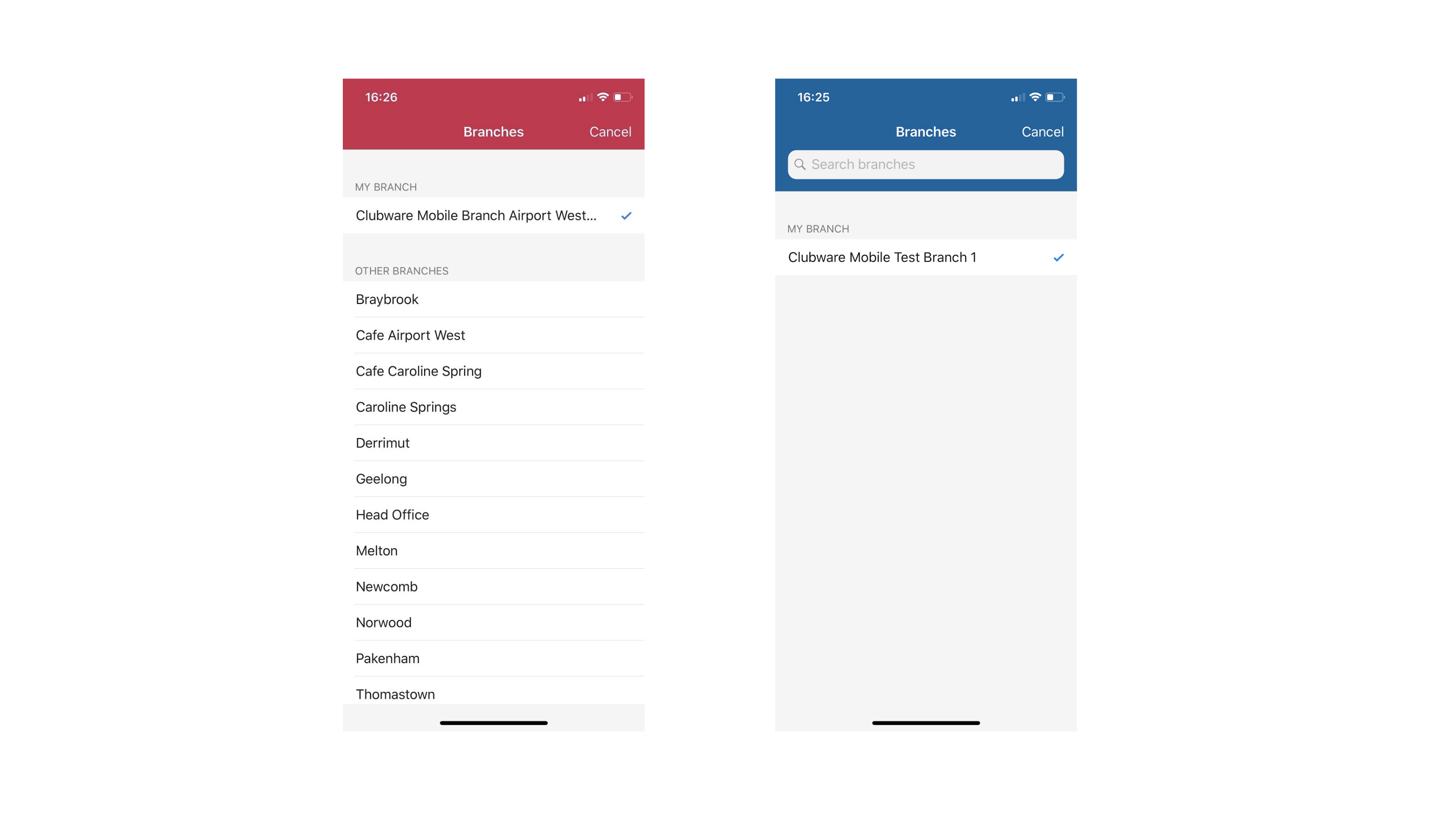
For example, on a view all branches screen imagine search box and just one branch in the list, will look great, right? Or 150 branches and no ability to search. To handle this situation make sure that search box appears only when you have more than 20 items listed.
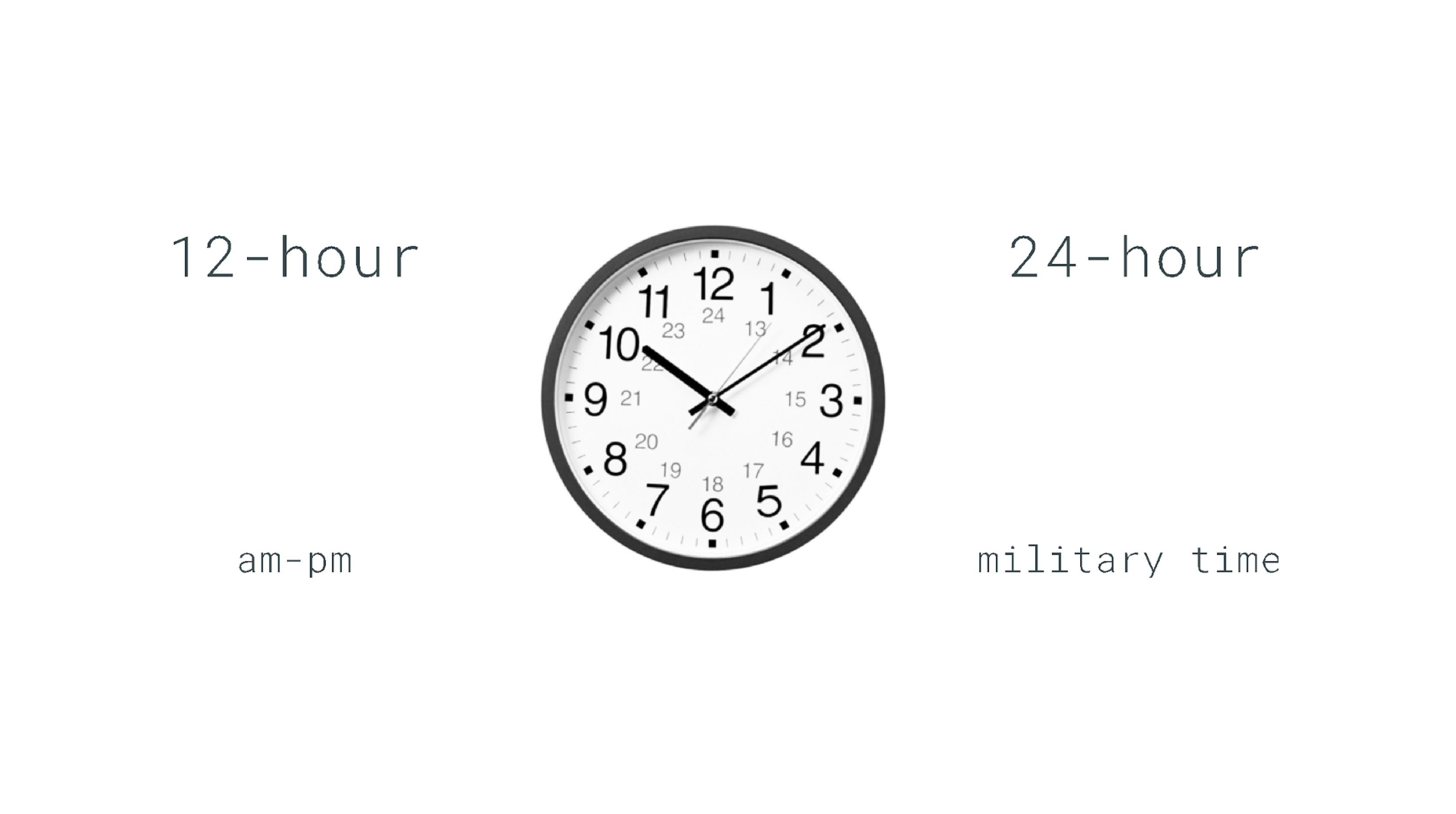
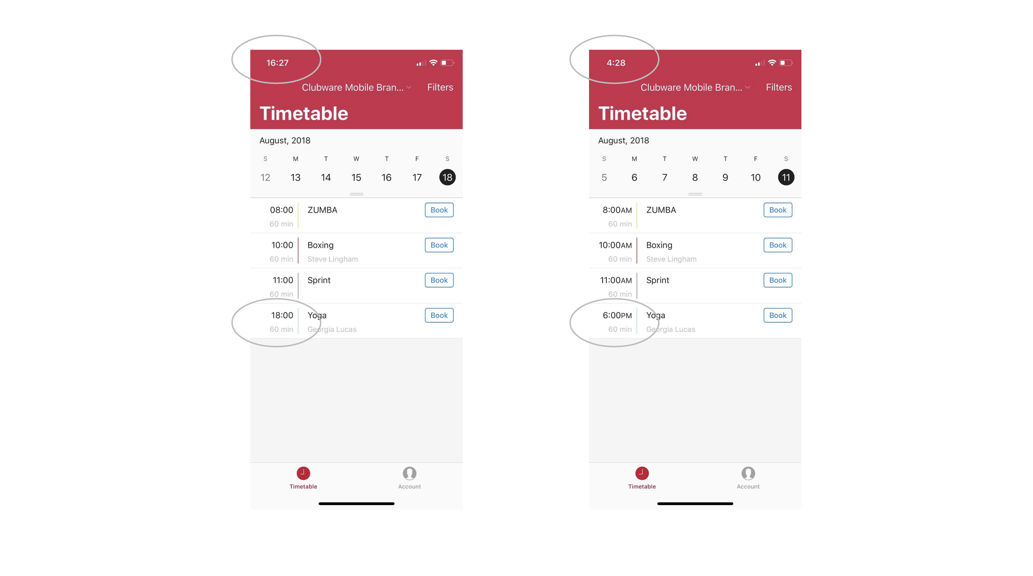
When you have an ambition to conquer/cover the world, always keep in mind that you support four countries now. New Zealand, Australia, UK and USA. This means different formats - like a timezone, addresses, bank accounts, time formatting. For example, what should you use for displaying time? 12 hour or 24 hour clock and from which day does the week begin?
Don’t play a guessing game. Most of these things can based on the device settings. This will create natural experience and keep consistency with the gizmo.
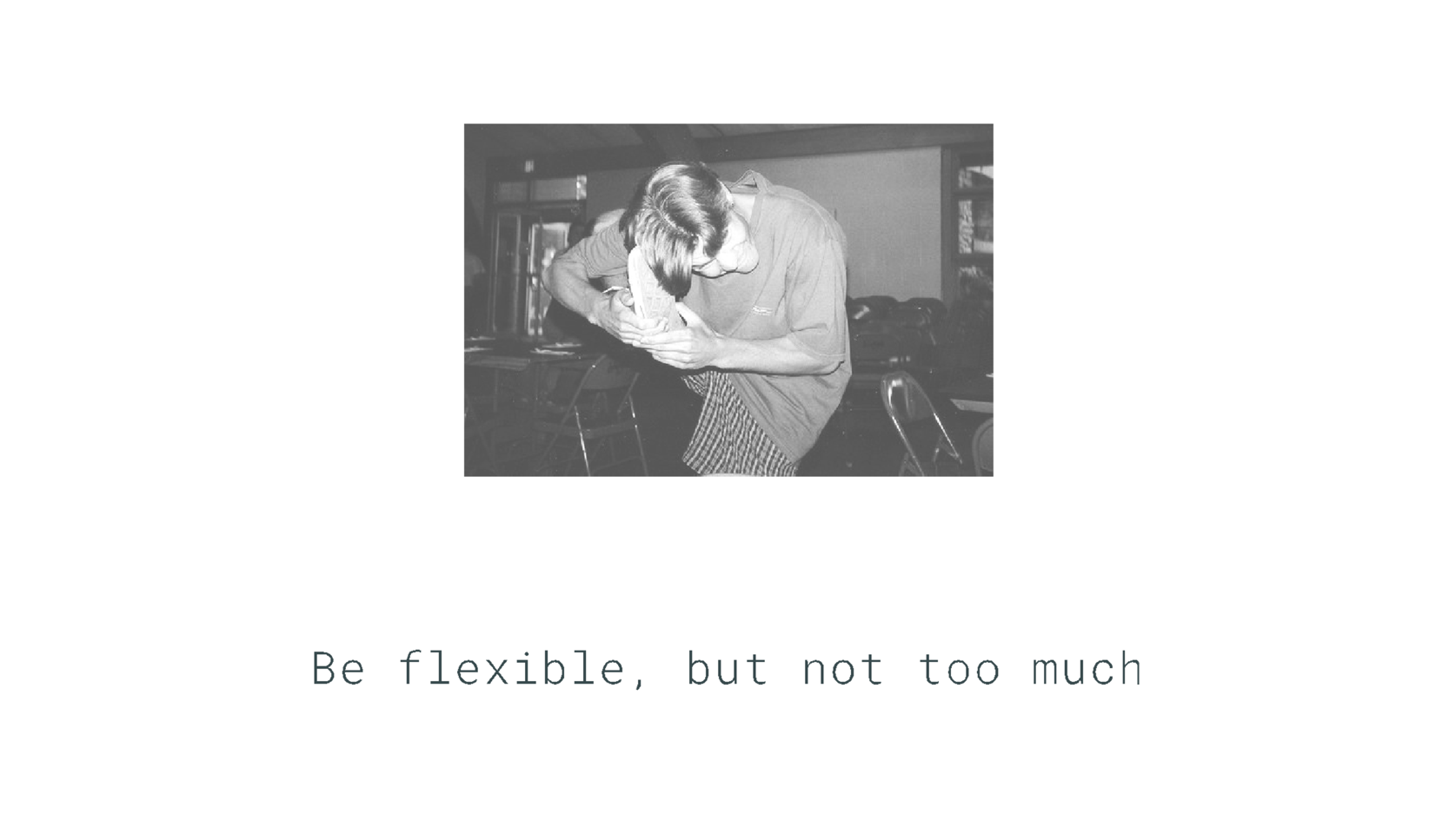
Be flexible, but not too flexible. If someone has a time-machine in the audience please let me address my last thought to myself in the beginning of this journey - it is cool to be flexible, but when you are too flexible you will have to deal with this light-mindedness in the future.